reinasong.
Resume↗
LinkedIn↗
2026
New Features in bank dashboard
Adding a new feature to an existing banking dashboard.

Brand
Canadian Tire Financial Services
Platform
Banking Website
Role
Product Designer
Team
Bank Squad
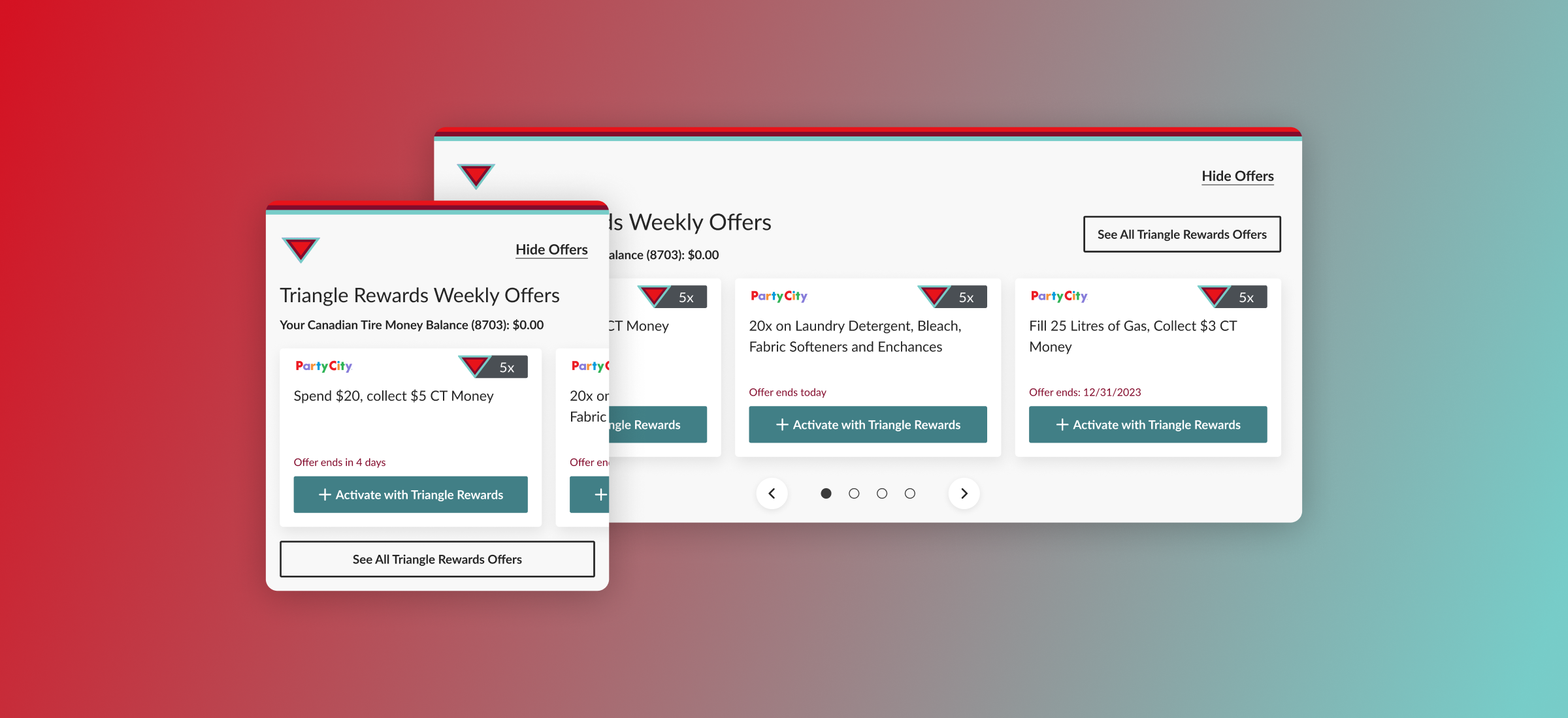
Overview.
This project started with understanding the business goal of bringing 1:1 personalized offers into banking experience to drive activation and to support sales on retail side.

Easy access to the personalized offers

Not distracting the core banking tasks
“
How it will work from users' perspective? How can users access offers in a clear path?
”

Competitor analysis.
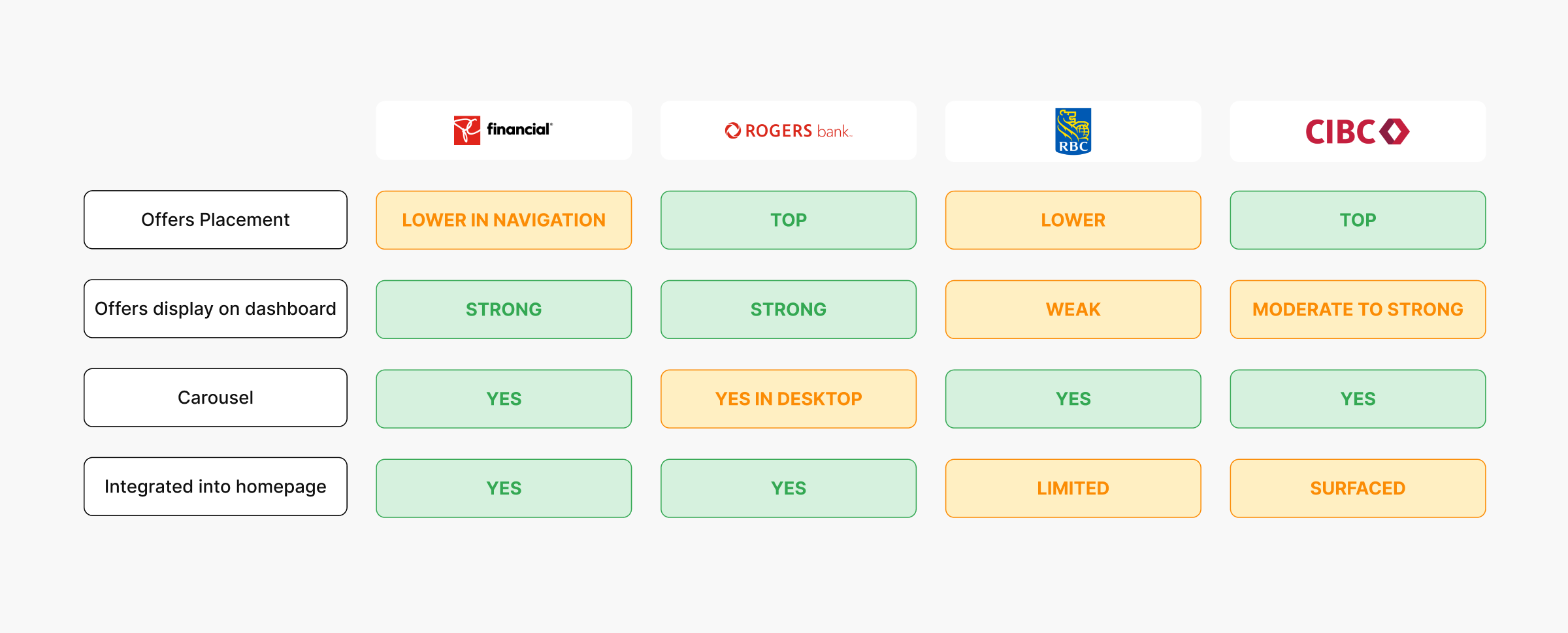
For comp scan, UX and UXR team collaborated to explore and scan how other banks placed their offers and different ways of integration.and we were able to get some insights that retail banks like PC or Rogers were tend to display offers but prioritizing the banking features, while traditional banks deprioritized displaying offers on main dashboard.
UX + Business alignment.
After research, team synced collaboratively to discuss “How might we surface Triangle offers on the bank summary page in a way that supports engagement, without distracting from users' core banking tasks, while still making it easy to navigate to the Triangle Offers page? under 4 main topics below to discuss:

How user enters flow without distracting core bank experience, while still easy to navigate offers?

How to ensure consistency of ux across the brands in retail and existing loyalty pages?

How to bring UXR insights to grab user’s interest let them to engage with offers quickly and easily?

How to sync and collaborate with dev and product team to fully understand constraints early on?
User testing.
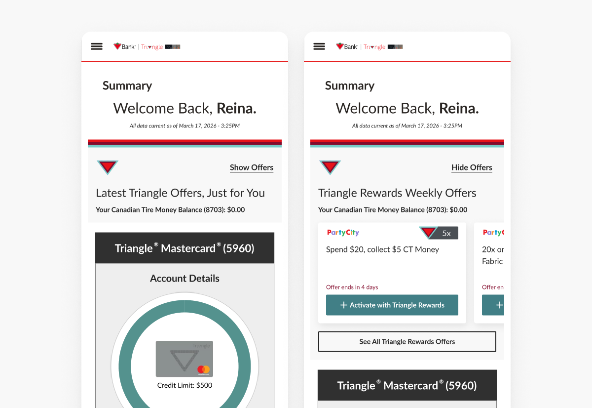
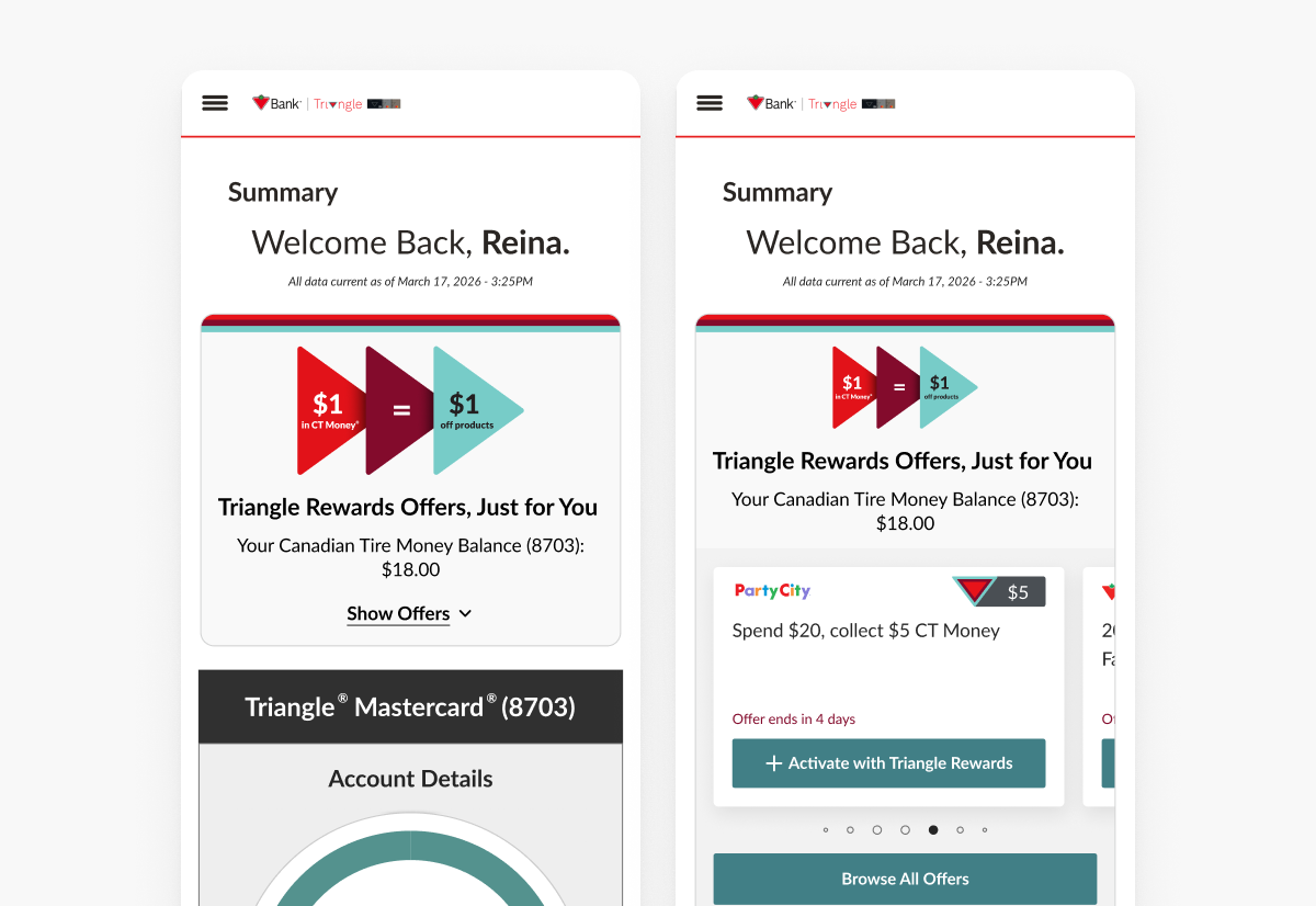
After many iterations and communications with teams, we decided to test 2 options with users. The goal of testing to understand participant sentiment around preferences between two versions of the banner on bank summary page. It also checked for preference in design as well as the copy, and expectations/understanding of where the CTA leads user to.
→ Final designs
→ Testing method

Usability testing
- 18 participants
- Canadian users
- Ages 29-56
- Triangle Mastercard/World Elite Mastercard holders + dashboard users
- Triangle Rewards members

Survey
- 144 respondents
- Canadian users
- Ages 21-65+
- Triangle Mastercard/World Elite Mastercard holders + dashboard users
- Triangle Rewards members
→ Recommendation from UXR
01 - Proceed with banner 2
as it tested well among the usability study participants and survey respondents in terms of copy and design.
02 - Prioritize the copy decision
as participants liked the engaging copy that entices interest and emphasizes personalization, but make sure we are not misleading the offer.
03 - Display CT Money Balance
in the carousel and outside of collapsible section as having it prominently displayed was a priority for most of participants.
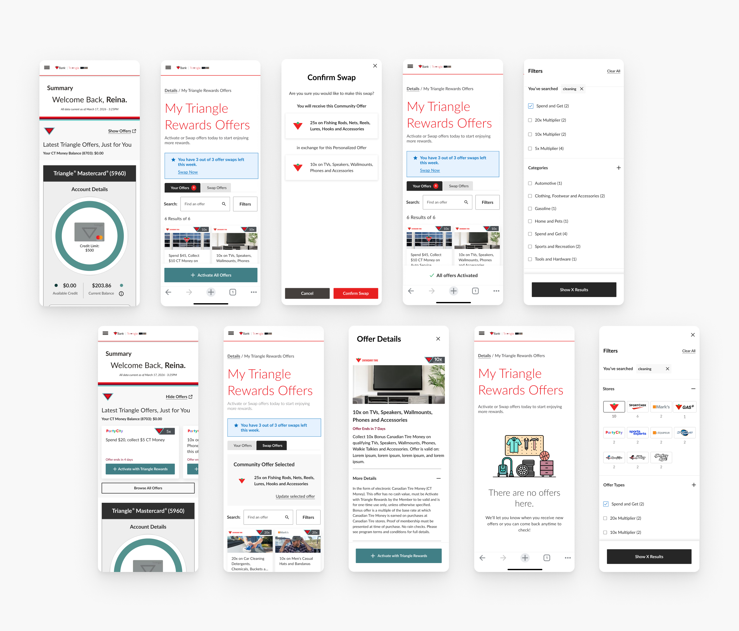
Final product.
What i learned.
Beyond this project, I learned the mindset I want to bring to a team to stay curious, keep iterating, and always push for better UX together.
01.
Protecting core experience is as important as adding a new value. Important to remind ourselves that innovation should never hurt the trust with the customers.
02.
Good engaging turns design into a business partner. Engaging leadership earlier to set expectations and to consider business impact, emphasizing stakeholder involvement.
03.
Cross-team collaboration + agile with appropriate resources, and pre-defining the constrains drove creating cohesive and impactful design solutions.
Looking for someone who understands design from marketing to product?
Let’s work together
reinasong.design@gmail.com ↗️
© Created by Reina Song, 2026
reinasong.
Resume↗
LinkedIn↗
2026
New Features in bank dashboard
Adding a new feature to an existing banking dashboard.

Brand
Canadian Tire Financial Services
Platform
Banking Website
Role
Product Designer
Team
Bank Squad
Overview.
This project started with understanding the business goal of bringing 1:1 personalized offers into banking experience to drive activation and to support sales on retail side.
Easy access to the personalized offers
Not distracting the core banking tasks
“
How it will work from users' perspective? How can users access offers in a clear path?
”

Competitor analysis.
For comp scan, UX and UXR team collaborated to explore and scan how other banks placed their offers and different ways of integration.and we were able to get some insights that retail banks like PC or Rogers were tend to display offers but prioritizing the banking features, while traditional banks deprioritized displaying offers on main dashboard.
UX + Business alignment.
After research, team synced collaboratively to discuss “How might we surface Triangle offers on the bank summary page in a way that supports engagement, without distracting from users' core banking tasks, while still making it easy to navigate to the Triangle Offers page? under 4 main topics below to discuss:
How user enters flow without distracting core bank experience, while still easy to navigate offers?
How to ensure consistency of ux across the brands in retail and existing loyalty pages?
How to bring UXR insights to grab user’s interest let them to engage with offers quickly and easily?
How to sync and collaborate with dev and product team to fully understand constraints early on?
User testing.
After many iterations and communications with teams, we decided to test 2 options with users. The goal of testing to understand participant sentiment around preferences between two versions of the banner on bank summary page. It also checked for preference in design as well as the copy, and expectations/understanding of where the CTA leads user to.
→ Final designs
→ Testing method
Usability testing
- 18 participants
- Canadian users
- Ages 29-56
- Triangle Mastercard/World Elite Mastercard holders + dashboard users
- Triangle Rewards members
Survey
- 144 respondents
- Canadian users
- Ages 21-65+
- Triangle Mastercard/World Elite Mastercard holders + dashboard users
- Triangle Rewards members
→ Recommendation from UXR
01 - Proceed with banner 2
as it tested well among the usability study participants and survey respondents in terms of copy and design.
02 - Prioritize the copy decision
as participants liked the engaging copy that entices interest and emphasizes personalization, but make sure we are not misleading the offer.
03 - Display CT Money Balance
in the carousel and outside of collapsible section as having it prominently displayed was a priority for most of participants.
Final product.
What i learned.
Beyond this project, I learned the mindset I want to bring to a team to stay curious, keep iterating, and always push for better UX together.
01.
Protecting core experience is as important as adding a new value. Important to remind ourselves that innovation should never hurt the trust with the customers.
02.
Good engaging turns design into a business partner. Engaging leadership earlier to set expectations and to consider business impact, emphasizing stakeholder involvement.
03.
Cross-team collaboration + agile with appropriate resources, and pre-defining the constrains drove creating cohesive and impactful design solutions.
Looking for someone who understands design from marketing to product?
Let’s work together
reinasong.design@gmail.com ↗️
© Created by Reina Song, 2026
reinasong.
Resume↗
LinkedIn↗
2026
New Features in bank dashboard
Adding a new feature to an existing banking dashboard.

Brand
Canadian Tire Financial Services
Platform
Banking Website
Role
Product Designer
Team
Bank Squad
Overview.
This project started with understanding the business goal of bringing 1:1 personalized offers into banking experience to drive activation and to support sales on retail side.
Easy access to the personalized offers
Not distracting the core banking tasks
“
How it will work from users' perspective? How can users access offers in a clear path?
”

Competitor analysis.
For comp scan, UX and UXR team collaborated to explore and scan how other banks placed their offers and different ways of integration.and we were able to get some insights that retail banks like PC or Rogers were tend to display offers but prioritizing the banking features, while traditional banks deprioritized displaying offers on main dashboard.
UX + Business alignment.
After research, team synced collaboratively to discuss “How might we surface Triangle offers on the bank summary page in a way that supports engagement, without distracting from users' core banking tasks, while still making it easy to navigate to the Triangle Offers page? under 4 main topics below to discuss:
How user enters flow without distracting core bank experience, while still easy to navigate offers?
How to ensure consistency of ux across the brands in retail and existing loyalty pages?
How to bring UXR insights to grab user’s interest let them to engage with offers quickly and easily?
How to sync and collaborate with dev and product team to fully understand constraints early on?
User testing.
After many iterations and communications with teams, we decided to test 2 options with users. The goal of testing to understand participant sentiment around preferences between two versions of the banner on bank summary page. It also checked for preference in design as well as the copy, and expectations/understanding of where the CTA leads user to.
→ Final designs
→ Testing method
Usability testing
- 18 participants
- Canadian users
- Ages 29-56
- Triangle Mastercard/World Elite Mastercard holders + dashboard users
- Triangle Rewards members
Survey
- 144 respondents
- Canadian users
- Ages 21-65+
- Triangle Mastercard/World Elite Mastercard holders + dashboard users
- Triangle Rewards members
→ Recommendation from UXR
01 - Proceed with banner 2
as it tested well among the usability study participants and survey respondents in terms of copy and design.
02 - Prioritize the copy decision
as participants liked the engaging copy that entices interest and emphasizes personalization, but make sure we are not misleading the offer.
03 - Display CT Money Balance
in the carousel and outside of collapsible section as having it prominently displayed was a priority for most of participants.
Final product.
What i learned.
Beyond this project, I learned the mindset I want to bring to a team to stay curious, keep iterating, and always push for better UX together.
01.
Protecting core experience is as important as adding a new value. Important to remind ourselves that innovation should never hurt the trust with the customers.
02.
Good engaging turns design into a business partner. Engaging leadership earlier to set expectations and to consider business impact, emphasizing stakeholder involvement.
03.
Cross-team collaboration + agile with appropriate resources, and pre-defining the constrains drove creating cohesive and impactful design solutions.
Looking for someone who understands design from marketing to product?
Let’s work together
reinasong.design@gmail.com ↗️
© Created by Reina Song, 2026