reinasong.
Resume↗
LinkedIn↗
2023
MCLAW iOS/Android app preview screenshots
Create a set of high-impact mobile app preview screenshots to showcase the app features, and deliver assets in different sizes for both iOS and Android while ensuring accessibility through contrast, legibility, and layout across.

Brand
Canada Life
Platform
Mobile app/goole store
Role
Visual UI designer
Team
Mobile
Overview.
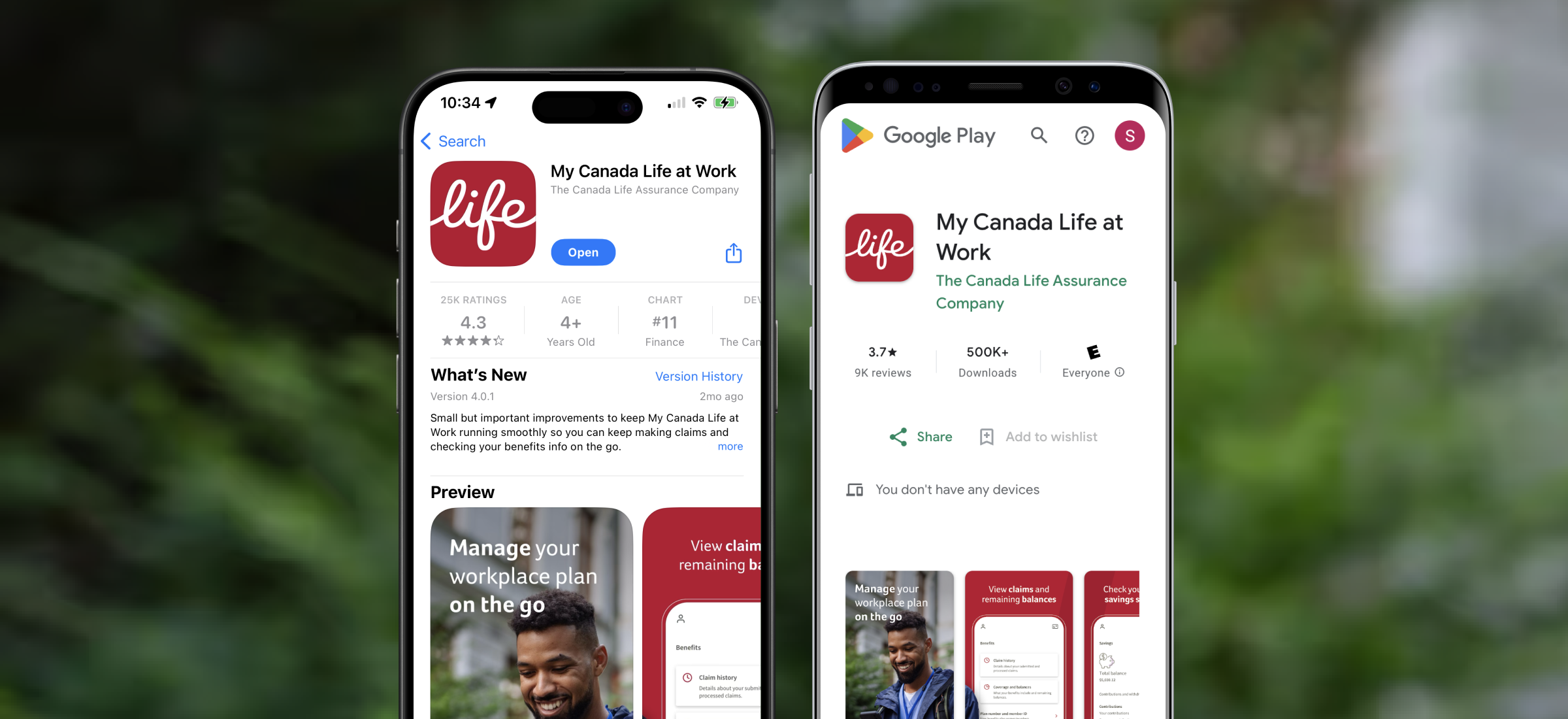
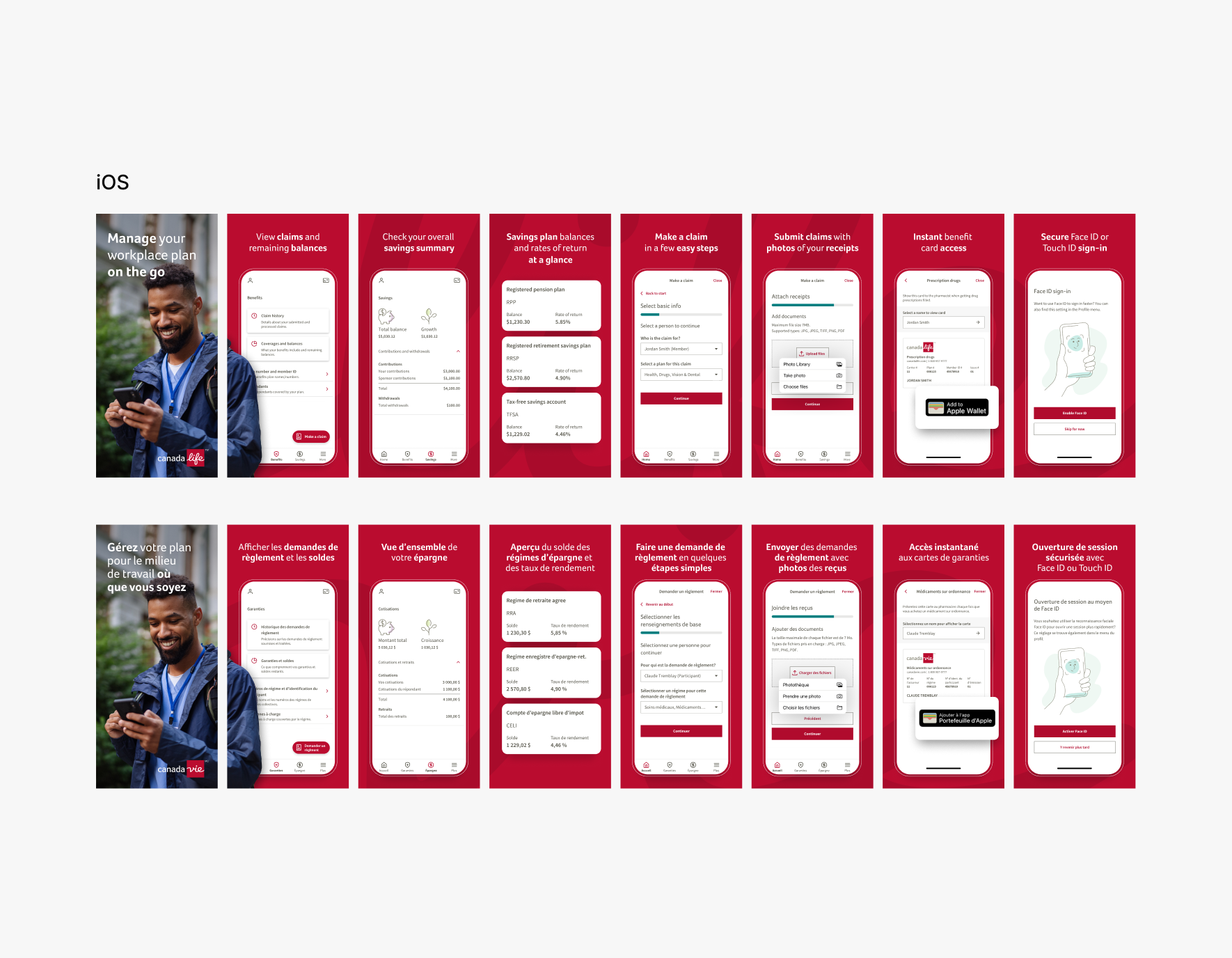
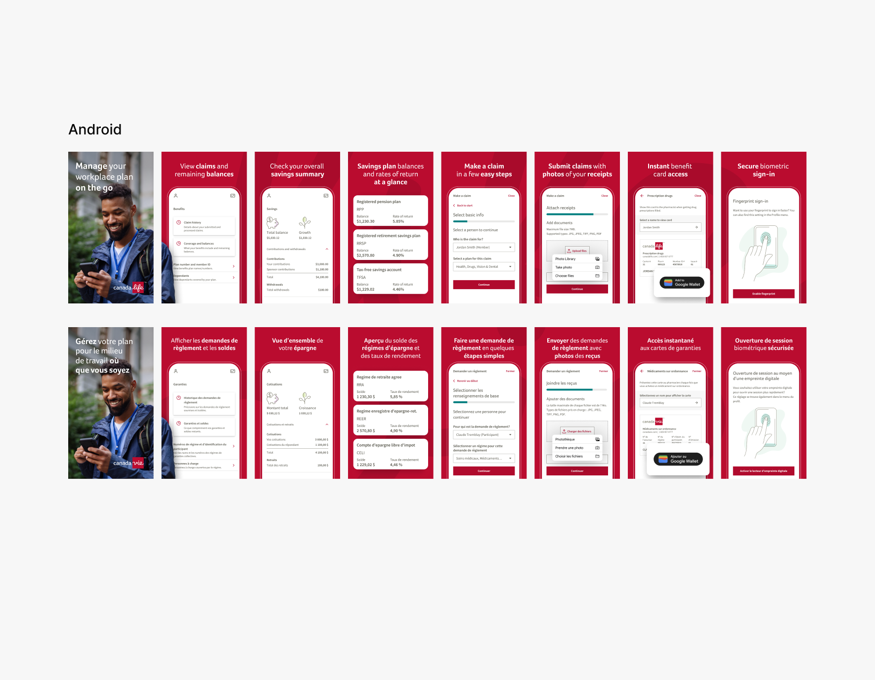
As a visual/UI designer, I supported UX team with new app launch in 2023 with preview screenshots. The screenshots were for app/google store product page highlighting value props and some app screens to showcase the features in the app. Created screenshots for different device sizes for better view for people from using small screens to bigger screens. Used imagery that shows great look and feel of Canada Life branding with catchy taglines from content team. There are slight differences in screenshots between each environment since each supports/priortizes different feature in their software.
How I designed
First impression of the app
Screenshots are first user touch-point, so design should instantly grab interest, show value, and appeal user to want to go through features and information.
Impactful messaging
Collaborate with content team to have catchy phrase that aligns with brand’s tone. Also, emphasize features in context in visuals that aligns with content for clear hierarchy and delivery.
Specs, sizes, and platforms
Work with developers to export assets in exact sizes cross devices and platforms.
Brand consistency
Maintain consistent brand tone, colour, and image across the full screen set for brand familiarity for all the current and potential app users.
Accessibility
Focus on accessibility, legibility, and visual balance to make sure everything works at a glance. Adjustment might need in copy length and alignment for extra polished look.
Looking for someone who understands design from marketing to product?
Let’s work together
Email me ↗️
© Created by Reina Song, 2026
reinasong.
Resume↗
LinkedIn↗
2023
MCLAW iOS/Android app preview screenshots
Create a set of high-impact mobile app preview screenshots to showcase the app features, and deliver assets in different sizes for both iOS and Android while ensuring accessibility through contrast, legibility, and layout across.

Brand
Canada Life
Platform
Mobile app/goole store
Role
Visual UI designer
Team
Mobile
Overview.
As a visual/UI designer, I supported UX team with new app launch in 2023 with preview screenshots. The screenshots were for app/google store product page highlighting value props and some app screens to showcase the features in the app. Created screenshots for different device sizes for better view for people from using small screens to bigger screens. Used imagery that shows great look and feel of Canada Life branding with catchy taglines from content team. There are slight differences in screenshots between each environment since each supports/priortizes different feature in their software.
How I designed
First impression of the app
Screenshots are first user touch-point, so design should instantly grab interest, show value, and appeal user to want to go through features and information.
Impactful messaging
Collaborate with content team to have catchy phrase that aligns with brand’s tone. Also, emphasize features in context in visuals that aligns with content for clear hierarchy and delivery.
Specs, sizes, and platforms
Work with developers to export assets in exact sizes cross devices and platforms.
Brand consistency
Maintain consistent brand tone, colour, and image across the full screen set for brand familiarity for all the current and potential app users.
Accessibility
Focus on accessibility, legibility, and visual balance to make sure everything works at a glance. Adjustment might need in copy length and alignment for extra polished look.
Looking for someone who understands design from marketing to product?
Let’s work together
reinasong.design@gmail.com ↗️
© Created by Reina Song, 2026
reinasong.
Resume↗
LinkedIn↗
2023
MCLAW iOS/Android app preview screenshots
Create a set of high-impact mobile app preview screenshots to showcase the app features, and deliver assets in different sizes for both iOS and Android while ensuring accessibility through contrast, legibility, and layout across.

Brand
Canada Life
Platform
Mobile app/goole store
Role
Visual UI designer
Team
Mobile
Overview.
As a visual/UI designer, I supported UX team with new app launch in 2023 with preview screenshots. The screenshots were for app/google store product page highlighting value props and some app screens to showcase the features in the app. Created screenshots for different device sizes for better view for people from using small screens to bigger screens. Used imagery that shows great look and feel of Canada Life branding with catchy taglines from content team. There are slight differences in screenshots between each environment since each supports/priortizes different feature in their software.
How I designed
First impression of the app
Screenshots are first user touch-point, so design should instantly grab interest, show value, and appeal user to want to go through features and information.
Impactful messaging
Collaborate with content team to have catchy phrase that aligns with brand’s tone. Also, emphasize features in context in visuals that aligns with content for clear hierarchy and delivery.
Specs, sizes, and platforms
Work with developers to export assets in exact sizes cross devices and platforms.
Brand consistency
Maintain consistent brand tone, colour, and image across the full screen set for brand familiarity for all the current and potential app users.
Accessibility
Focus on accessibility, legibility, and visual balance to make sure everything works at a glance. Adjustment might need in copy length and alignment for extra polished look.
Looking for someone who understands design from marketing to product?
Let’s work together
reinasong.design@gmail.com ↗️
© Created by Reina Song, 2026
reinasong.
Resume↗
LinkedIn↗
2023
MCLAW iOS/Android app preview screenshots
Create a set of high-impact mobile app preview screenshots to showcase the app features, and deliver assets in different sizes for both iOS and Android while ensuring accessibility through contrast, legibility, and layout across.
Brand
Canada Life
Platform
Mobile app/goole store
Role
Visual UI designer
Team
Mobile
Overview.
As a visual/UI designer, I supported UX team with new app launch in 2023 with preview screenshots. The screenshots were for app/google store product page highlighting value props and some app screens to showcase the features in the app. Created screenshots for different device sizes for better view for people from using small screens to bigger screens. Used imagery that shows great look and feel of Canada Life branding with catchy taglines from content team. There are slight differences in screenshots between each environment since each supports/priortizes different feature in their software.
How I designed
First impression of the app
Screenshots are first user touch-point, so design should instantly grab interest, show value, and appeal user to want to go through features and information.
Impactful messaging
Collaborate with content team to have catchy phrase that aligns with brand’s tone. Also, emphasize features in context in visuals that aligns with content for clear hierarchy and delivery.
Specs, sizes, and platforms
Work with developers to export assets in exact sizes cross devices and platforms.
Brand consistency
Maintain consistent brand tone, colour, and image across the full screen set for brand familiarity for all the current and potential app users.
Accessibility
Focus on accessibility, legibility, and visual balance to make sure everything works at a glance. Adjustment might need in copy length and alignment for extra polished look.
Looking for someone who understands design from marketing to product?
Let’s work together
reinasong.design@gmail.com ↗️
© Created by Reina Song, 2026